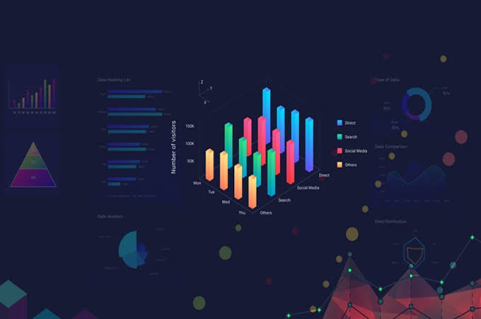
Data has become crucial to every project, company, and industry. However, the fact that you can keep track of your numbers does not necessarily mean you can apply them in any meaningful manner. That’s where data visualization comes in to transform raw data into useful knowledge. That further helps people understand the relationships, trends and patterns they might not see from raw data.
There are numerous ways of analyzing and applying your data, and so are several types of data visualizations. Working with the right one ensures you display data in the most relevant form and ultimately find the information you are seeking. But, what visualizations really do the trick and how can you use them? Find out from the list below:
Sankey Diagram
A Sankey diagram is used for creating and visualizing flows between data. The diagram shows the flow quantity proportionately in that wider links display greater quantity and vice versa. The diagram is designed in a way that the links connect the different processes.
Flows in a Sankey diagram can be fused or separated through a series of events or stages to draw out potential business opportunities from the visualization.
Sankey charts are a great choice when you need to focus on a single resource in a complex process. They enable insightful decision-making, particularly when analyzing resources such as time, energy and money. More recently, Sankey diagrams have gained popularity in healthcare, finance management, retail, manufacturing, communication sector, and public sector.
For instance, in the public sector, Sankey diagrams are used in the analysis of population migration between countries, to show cost of living, as well as what people spend their money on.
In the communication sector, these types of charts are used to demonstrate the relationship flow between product categories and customer segments.
Elsewhere, energy firms use Sankey charts to visualize fuel, explore consumption, and analyze transmission flows.
Pareto Chart
A Pareto chart/diagram is a special type of bar graph. It is based on the Pareto principle, commonly known as 80-20 rule, which states that in most cases, 80% of the results come from 20% of the causes. The principle owes its discovery to one Italian mathematician, Vilfedo Pareto, who revealed that 80% of the land in Italy was controlled by 20% of the country’s population.
In the business world, especially in sales and marketing, Pareto is interpreted as the fact that 80% of the sales come from 20% of the clients. It’s a strong reminder that the relation between outputs and inputs isn’t always balanced. For firms based on client-service dynamics, the Pareto principle is highly applicable.
A typical Pareto diagram has the left vertical axis representing frequency and the right vertical axis representing cumulative percentage. Data that’s being examined is shown on the horizontal axis. The longest bars are arranged on the left side while the shortest bars on the right. Also present on the bar graph is a line graph, which represents the cumulative total.
As you would expect, Pareto analysis is not applicable to all cases in the workplace. But when you need to find issues with the biggest effects on the outcomes of any given situation, employ the principle.
Likert scale
Likert scales are used to measure opinions, perceptions and behavior, but they do this with a greater degree of nuance rather than a simple yes or no. In business, Likert scales are best used to comprehend how customers feel about you, your product or service.
In addition, they can tell you more about your customers’ reactions on a product/service performance after a new launch. From there, you can go on and evaluate their answers to get a comprehensive view of their opinions. Market research companies use Likert scales to conduct various kind of surveys.
Likert scales can vary from simple 2-point survey scales to complex 10-point survey scales. However, the most common scales are 5-point scale and 7-point scales. In the former, you’ll typically have two extreme options, two intermediate, and one neutral option. An example includes a survey with these options; very difficult, difficult, neutral, easy, and very easy.
The legendary 7-point scale can have options such as; never, rarely, occasionally, sometimes, frequently, usually, and every time. The begging question in this regard can be something like ‘how often do you use our product’.
The downside with Likert scales is that if used without open-ended questions, it ends up gathering quantitative data but not qualitative. For instance, if a customer says they are not satisfied with your service, the reason why they aren’t would still remain unanswered. So keep that in mind when using Likert scales.
Final Thoughts
Now, the list above is definitely not an exhaustive one, but a few that are widely used in analyzing complex data, especially the Sankey diagram. Apart from the above, you can create bullet graphs, bubble charts, population pyramids, box plots, and waterfall charts, as the need demands.
The bottom line is that data visualization techniques are meant to present data in a manner that makes information easy to digest and comprehend at a glance. Data can be represented in numerous ways and so you should take care when selecting the best chart or graph for visualization. See you in the next one!


